
In the one of the latest issues of the UI Animations Newsletter, Val Head proposed basing UI animations on the voice and tone guidelines your company uses for PR/Customer support etc.:
Voice and tone documents can be a helpful source to inform how you design your UI animation. They’re especially helpful for getting past that “blank page syndrome” for animation ideas because they define a direction to aim for.
So, I tried it a few weeks ago when I thought about how we could spruce up the animations within the Jimdo interface. Since I poured a lot of text into a GitHub issue about the whole topic, I figured I should publish these thoughts here for other people to get an idea of how this advice could work for them.
I used Material Design Motion (MDM) as a base to build upon since it is a great tool and has very good ideas on how to animate a user interface. The majority of their content can be applied to many use cases, including the Jimdo one.
Collecting from the voice and tone guidelines
At Jimdo, we use a brand book which I browsed for adjectives and nouns that suggest how Jimdo brand should be presented. Of course, I found most of them in the “voice” part of the brand book:
- thrill
- joyful
- enthusiasm
- delight
- smooth
- enjoyable
- lighthearted
- playful
If I use these words and apply them to the interface, I would imagine the interface to have:
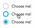
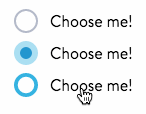
- Happy/enthused activation/hover states. Let the interface be “happy” about user interaction. (But in a cool way, of course.)
- Have a playful, smooth, light(hearted) (dis-)appearance of elements
- Be smooth when it comes to speed. We want to animate to help the user and make the experience of using our system better. The animations should not make the user wait. We do not want to show them fireworks and confetti each time they open the browser.
This seemed to be a good foundation to check with teammates. I talked to people with different backgrounds (UX, product design, UI engineering, frontend developers,…). Literally everyone quickly replied: “But we don’t want to do too much and people should not wait!” — which was funny so I figured I’d need to…
Think about speed
An animation should not happen too fast to notice a difference between a direct change and the animation, since that would defeat the purpose of making it feel more natural and less technical. It should be “just right”. This leads to some basic guidelines:
- Elements entering the screen should ease into the final position, slowing down when going there.
- Elements leaving the screen should leave quickly since they are not needed anymore.
- Elements moving on screen take time relative to the distance they travel. Normally, elements do not travel too far within the system, so you barely have a very long transition.
Since most of our users currently work on desktop computers, elements can move fast. MDM has a good point here:
Desktop animations should be faster and simpler than their mobile counterparts. These animations should last 150ms to 200ms.
Because desktop transitions may be less noticeable, they should be immediately responsive and faster than their mobile counterparts.
Complex web transitions often result in dropped frames (unless they are built for GPU acceleration). Shorter durations will make these less noticeable because the animation completes faster.
That’s how I arrived at these possible speeds for different animations:
$veryfast: 100ms;
$fast: 150ms;
$medium: 250ms;
$slow: 350ms;
$veryslow: 500ms;
Animating elements
As said above, depending on what happens to an element, we should use different animations for different cases. Therefore, I derived some easing curves from the ones MDM suggests.
The curves used within MDM feel very straightforward and technical. So based on the adjectives I derived, I decided to make them a bit more playful while keeping the general idea of accelerating quickly and decelerating more slowly. The main difference: Our animations reach a bit over the top before stopping. For the standard curve, this is barely noticeable, which actually is fine. People shouldn’t really notice the animation and rather get the correct impression through the interaction without actively thinking about it.
The standard curve
cubic-bezier(0.4, 0.0, 0.2, 1.4);
Enter screen curve
cubic-bezier(0.0, 0.0, 0.2, 1.4);
Exit screen curve

cubic-bezier(0.4, -0.4, 0.6, 1.4);
The good thing about these curves is: you don’t have to care about the overreach when implementing anything. The curve will take care of e.g. growing the animated item beyond the final state and back. This makes using the animations way easier and is a nice bonus for everyone not that involved with how the animation should work — they can simply “plug&play” the animations.
These ideas are currently not represented within our system but we’re getting there. One thing we already noticed is that it is very difficult to put these animation curves into mixins that can be thrown into the CSS code immediately.
We use a pattern library. In it, a lot of animations can be generalized and used in a consistent way. If larger parts of the system need animation, these should rather be handcrafted instead of using a one-size-fits-all approach through mixins. While this will take more effort to accomplish, it will result in better animations throughout the system.
The basics are given through these animation curves–thanks to the voice and tone guidelines 😊